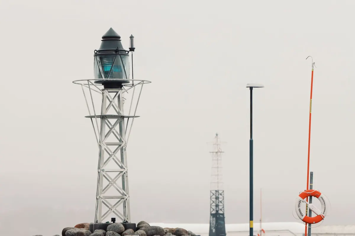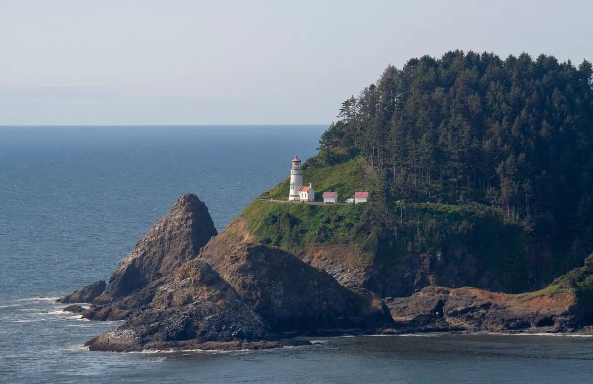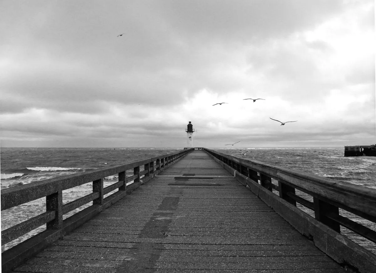
A lighthouse looks like a simple shape until you try to draw one. The tower leans a little, the gallery flattens into a stripe, and the railing becomes a row of pickets that seem to march uphill. None of that is a failure of talent. It is almost always a question of where your horizon sits, and whether your ellipses agree with it.
One-point perspective suits this subject well, because a lighthouse is mostly a vertical cylinder seen roughly head-on. Verticals stay vertical, and circles stay circles, opening up or closing down depending on how far they sit from your eye level. Get that single relationship right and the rest of the scene — the rocks, the path, the water — settles around it without a fight.
Here is a full build, from the first horizon line to the last shadow under the gallery deck. Work lightly at the start, keep a soft eraser nearby, and resist the urge to darken anything until the structure is settled.
Start With Eye Level, Not With the Tower
Before you draw a single edge of the tower, decide where you are standing. That decision is the horizon line, and it governs the whole drawing. Place it low, around a third of the way up the page, and the lighthouse looms above a viewer standing on the rocks. Place it high, and you are on the cliff top looking down, with more shoreline and more of the gallery floor visible.
Mark a single vanishing point on that horizon, then slide it left or right of centre. A tower placed dead centre tends to look like a diagram; a tower a third of the way in, with open sea on the other side, reads as a picture. Draw a faint construction line through the vanishing point so you can check yourself later, and keep it pale enough to erase.
One rule does most of the work from here: anything at your eye level sits on the horizon line. If the lantern room falls above it, you will see the undersides of the gallery deck and the roof overhang. If the gallery sits below it, you will see the top surface of the deck instead. Decide this now, because it changes every curve you draw later.
Block the Tower as a Tapering Cylinder
Draw the central axis first: one straight vertical line, from the base up through where the lantern will sit. Everything else hangs off it. Next, mark the width of the tower at the base, then the narrower width at the top. Real towers taper, often by a sixth or so, and the taper must be symmetrical about the axis or the whole building will look like it is falling over.
Before committing to proportions, measure. Hold a pencil at arm's length, line up the base width against the tower's height, and note the ratio. A common and believable figure is roughly one to five — a base five times narrower than the tower is tall, though stout harbour lights and slender ocean towers vary. Lay a strip of paper along the height, mark the base width on it with your thumb, and use that strip to check the width at three or four heights. It is a small habit that saves a lot of redrawing.
Keep the sides of the tower as two straight converging lines rather than a curved silhouette. A lighthouse is a cone in disguise, not a bottle.
Stack the Bands and Keep the Ellipses Honest
Bands, doorways, windowsills and the gallery platform are all horizontal circles wrapped around the tower. In one-point perspective they appear as ellipses whose openness depends on their height relative to the horizon. Near eye level, an ellipse is almost a straight line. Far below it, the ellipse opens into a fuller, rounder shape. This progression, not detail, is what makes the tower feel tall.
If an ellipse on your sheet is a dead straight line, that band is exactly at your eye level. There is no other correct answer.
Draw each ellipse through four points: the left and right edges of the tower, and the near and far points on the axis. The near point always sits closer to the bottom of the page than the far point when the band is below eye level, which gives bands a gentle downward dip at the front — a shallow smile. Above eye level, the same logic flips: undersides arch upward. Mixing the two is the single most common reason a lighthouse looks warped.
To space bands evenly without measuring each one, use a paper strip: mark the first interval on it, then step it up the tower, checking against the axis. For window openings, keep their vertical edges truly vertical and their tops and bottoms as short arcs following the band curve.
Build the Gallery and Lantern Room
The gallery is an overhanging disc, so draw it as two ellipses — the outer edge and the inner wall — plus a thin vertical rim for thickness. If the gallery sits above your horizon, add a narrow dark arc beneath the outer edge for the underside; that sliver of shadow is what makes the platform feel like it projects into the air.
For the railing, mark the posts so that the gaps crowd together toward the silhouette edges of the gallery and open up near the middle. Even spacing across the page flattens the platform instantly. Keep every post vertical, and let their bases and tops follow the curve of the deck.
The lantern room is a short glazed drum. Its mullions stay vertical but their spacing tightens toward the sides, exactly like the railing. Above it, the roof is a shallow cone or dome: an ellipse at its base, a curved silhouette, and the apex on the axis. A small finial ball, shaded on the side away from your light source, finishes the stack.
Set the Shoreline on the Same Vanishing Point
Now give the tower somewhere to stand. The shoreline can curve and wobble, but its receding edges should still aim at the vanishing point. A quick test: lay a straightedge along a stretch of the near shoreline and see where it points. If it drifts toward the middle of the page instead of the marked point, correct it before adding texture.
- Water lines: flatter and closer together as they approach the horizon, wider apart in the foreground.
- Foam: horizontal streaks around the rocks, broken into segments rather than continuous outlines.
- Rocks: irregular in shape, but their bases should sit on lines that converge toward the vanishing point.
- Path or steps: a wedge that narrows as it climbs, with step edges curving gently if they sit off eye level.
- Cast shadow: pick one light direction and keep it. The tower's shadow falls across the ground in a band that also runs back toward the vanishing point.
Shade the shadow side of the tower with a graded tone, leaving the lit side as bare paper. For a coastal scene, a light source slightly above and behind the viewer keeps the silhouette clean and the sea bright.
Five Mistakes That Flatten a Lighthouse
- Ellipses all the same roundness. Vary them from near-flat at eye level to fuller below.
- The axis wandering. Check each stack level against the original vertical line; small drifts read as a leaning tower.
- Undersides drawn on a tower you are looking down on. Decide above or below eye level and stay consistent.
- Evenly spaced railing posts and mullions. Compress them toward the sides.
- Two light directions. One shadow direction, one highlight, no exceptions.
A Ten-Minute Sequence to Practice
Draw this small, on a single sheet, and repeat it until it feels automatic:
- Horizon line, one vanishing point off-centre, faint construction line.
- Vertical axis, base width, top width, two converging sides.
- Three ellipses up the tower — base, mid-band, gallery level — each a little flatter than the one below.
- Gallery disc, rim, railing with crowded side spacing.
- Lantern drum, roof cone, finial.
- Two shoreline lines running to the vanishing point, a few rocks, one cast shadow.
Keep the construction lines visible for the first few attempts. They are the drawing's scaffolding, and looking at them shows you exactly where the shape went wrong. Once the stack holds together at thumbnail size, scale up and add the texture — brick courses, rust streaks, spray. Structure first, surface second. That order is what separates a lighthouse that stands on the headland from one that looks pasted onto the page.
Photo: Mat Brown / Pexels