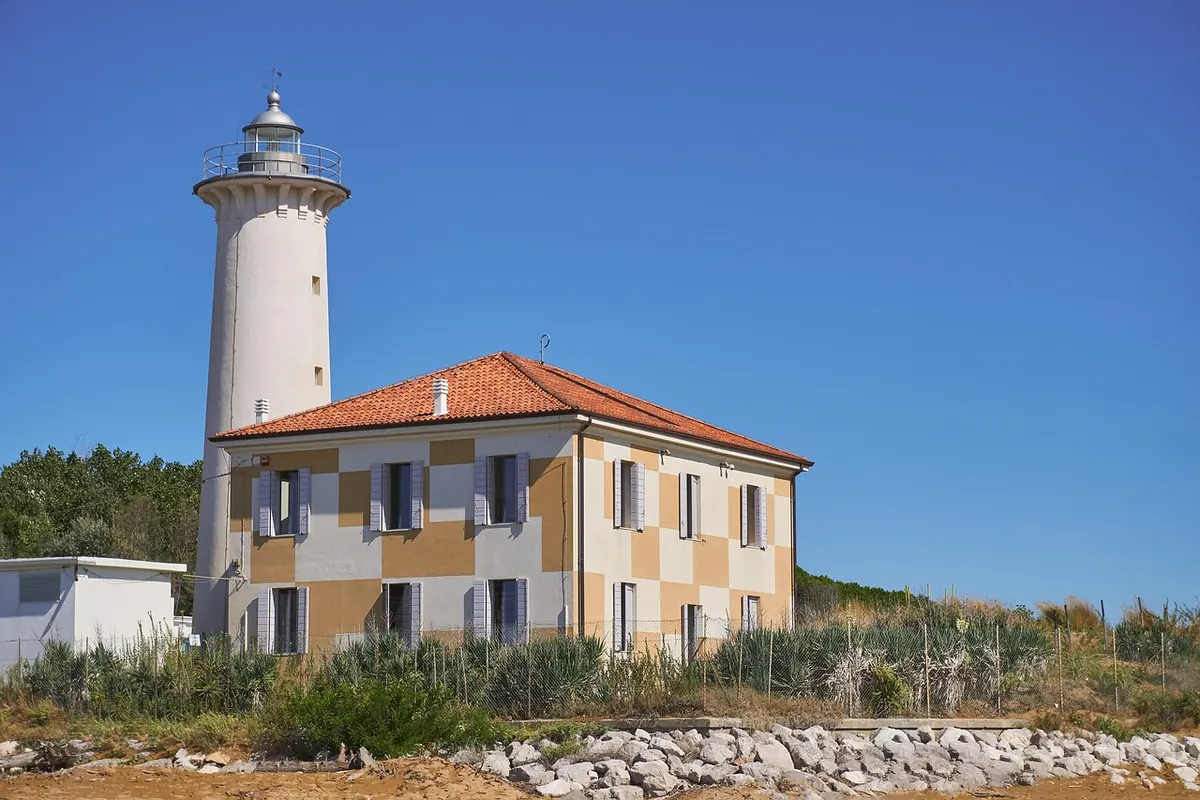
Italian lighthouses rarely sit anywhere convenient. They crown headlands that take forty minutes of dusty walking, they end harbour moles where the wash finds your shoes, and they slip behind a hill just as the light turns good. That awkwardness is a fair guide to their value as subjects: if a lighthouse is hard to reach, the view from it — or of it — usually has something worth drawing. The decisions below all happen before the pencil moves. Where to stand, where to put the tower on the page, how much coast to let in around it.
Read the coast before you open the sketchbook
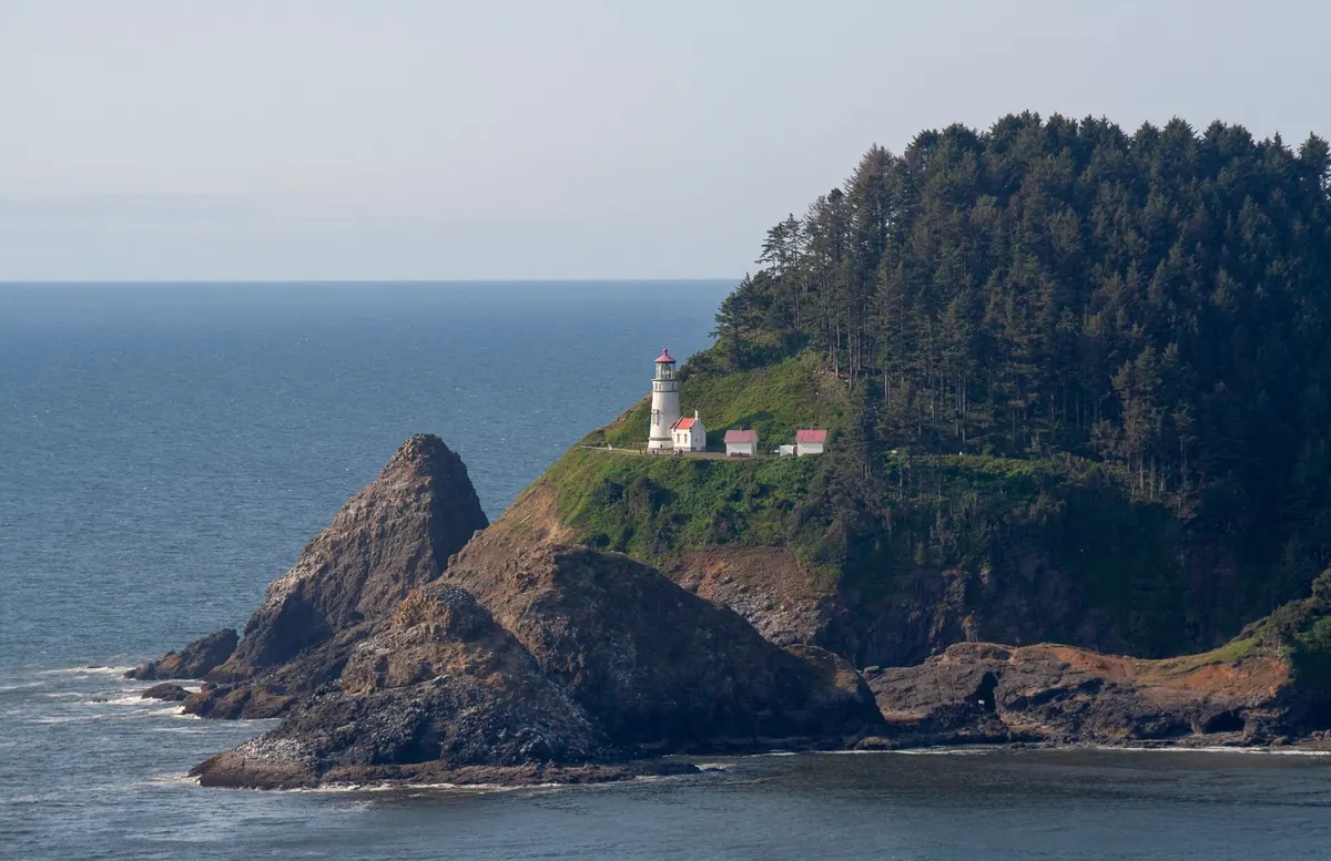
Start with a map, a satellite view and the weather, not a pencil. On the Ligurian coast the towers tend to be pinned to steep ground, so the sea sits far below and the land rises immediately behind. That geometry decides your composition before you arrive. On the Adriatic the ground is flat and the horizon is long, so a lighthouse at Caorle or near the Tagliamento mouth reads as a small vertical event in a very wide horizontal field. Those are two different drawings, and it helps to know which one you are walking into.
Look for three things on the map: the direction the tower faces open water, the paths and roads that approach it, and whatever stands between you and the building — a hill, a keeper's house, a pine wood. Then check conditions. A moderate swell on a west-facing coast can close the rocks at the base of a tower, and a bora day in Trieste will take the paper out of your hand. Line up two viewpoints before you set out, so a locked gate or a closed path doesn't end the afternoon.
Four viewpoints that repay the walk
The common mistake is to walk to the lighthouse and draw it from wherever you happen to stop. Circle it first, even if the circuit costs twenty minutes. These four positions cover most situations.
- The foot of the headland. Stand low and to one side, looking up. The upward view compresses the tower, exaggerates the rock beneath it and gives you a strong diagonal. It works best when you can get a slice of sea behind the lantern.
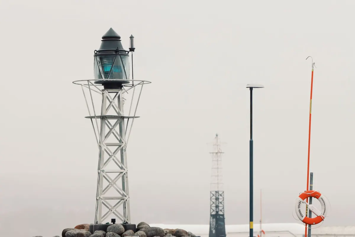
- Water level, from a quay or breakwater. Drop the horizon to a third or a quarter of the page and the tower stands in air and water. Reflections on wet stone do half the work for you.
- A terrace or switchback road above. Roofs, umbrella pines and stone steps become foreground, and the tower sits in the middle distance where you can place it deliberately rather than accept it.
- A ferry or a small boat. This gives the profile no land view offers, plus the relationship between tower and town behind it. Work small and fast; the boat will not wait for your hatching.
Two more positions are worth knowing. From inland, a tower stands against pale water and reads as a dark shape; from seaward, it stands against sky and reads as a silhouette. Neither is better, but they ask for different handling of value. And the service road behind a lighthouse — the back of the keeper's house, the fuel store, the washing line — often gives the more honest drawing than the postcard angle.
Putting the tower on the page
Choose the paper shape before you choose the view. Tall towers want portrait format; low harbour lights on flat coasts want landscape. Then place the horizon on purpose. A high horizon pushes the sea and foreground forward; a low horizon gives the tower room to breathe. Whatever you do, keep the horizon line from slicing exactly through the lantern gallery — shift it clearly above or below.
Keep the tower off centre. A third from one edge is a reliable starting point, not a law, and it lets you include the thing that makes the site particular: the cliff face, the curve of the mole, the line of moored boats. Check for tangents, those accidental meetings where the edge of the tower touches the edge of a rock or a roof. Move your feet a metre and they usually disappear.
Finally, give the eye an entrance. A bollard, a capstan, an agave, a shadow thrown across the quay, a low wall running in from the corner — any of these carries the viewer up to the tower. The tower's own shadow is often the best lead-in line on the page, and it is free.
Choosing your hour, and your weather
Two coasts, two directions of light
On the Adriatic the sun rises out of the sea, so early mornings give backlight and a silver path on the water. On the Tyrrhenian it sets into the sea, which is why so many western lights — Portofino, Punta Campanella, Capo Palinuro — look their most interesting in the last hour before dusk. Plan by direction rather than by the clock.
Grey days are undervalued. Flat light removes the glare and hands you the value structure for free, which is exactly what you need when the subject is a white tower against pale stone. Windy days are worth a try too, with a bulldog clip and a heavy board: spray over a breakwater gives you movement that a calm afternoon never will.
Deciding what to leave out
Squint at the scene and count the values. Most lighthouse views reduce to three or four: the dark of the rock or the keeper's house, the mid-tone of the sea, the light of the tower, and the sky. If you can hold those apart, the drawing will read from across a room.
Then decide which details earn their place. The lantern glass and its railing, the gallery shadow, the painted band, the door at the base, a single figure on the steps for scale — that is usually enough. Courses of stonework, individual railing bars and every wavelet can stay out. Test the drawing in progress by imagining the tower as a solid black shape: if the silhouette is recognisable, the detail is a bonus rather than a rescue.
A two-hour working sequence
- Walk the site for fifteen minutes and draw four thumbnails, each no bigger than a matchbox. No detail, just horizon and tower.
- Pick one. Rule in the horizon lightly and mark the tower's vertical axis.
- Block the big shapes: rock mass, sea band, sky, buildings, foreground anchor.
- Separate values before adding line. Keep the darkest dark for the gallery shadow or a window recess.
- Add detail only where it identifies the place — the lantern, the railing, the vegetation line, the door.
- Write in the margin: time, wind direction, the colours you actually saw, and the name of the light.
Keep a coast notebook
One sketch of a lighthouse is a postcard; five are a study. Return to the same tower at a different hour, from the opposite side, in weather you didn't plan for. Note the name of each light in the margin, along with the date and the conditions, and the notebook slowly becomes a record of the coast rather than a collection of pictures. Take a soft pencil, a fineliner, a small watercolour box, water, and a hat. Then walk past the obvious viewpoint and see what is thirty metres further on.
Photo: distelAPPArath / Pixabay