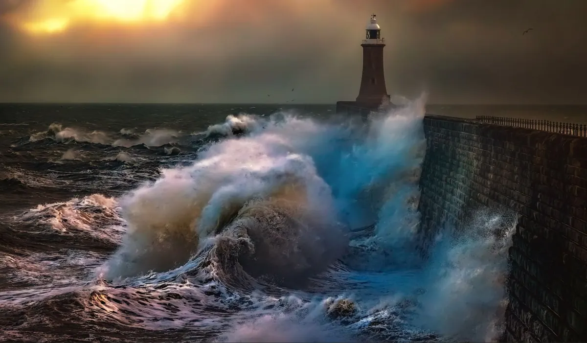
The first proper gale of autumn changes a lighthouse. The tower you drew all summer as a neat white column becomes a dark shape leaning into weather, half erased by spray, with a sky behind it that will not hold still for anybody. That is exactly why storm season is worth planning for. Rough weather strips a scene down to its bones — dark against light, solid against moving — and those are the terms a sketchbook understands best.
Why Bad Weather Makes Better Drawings
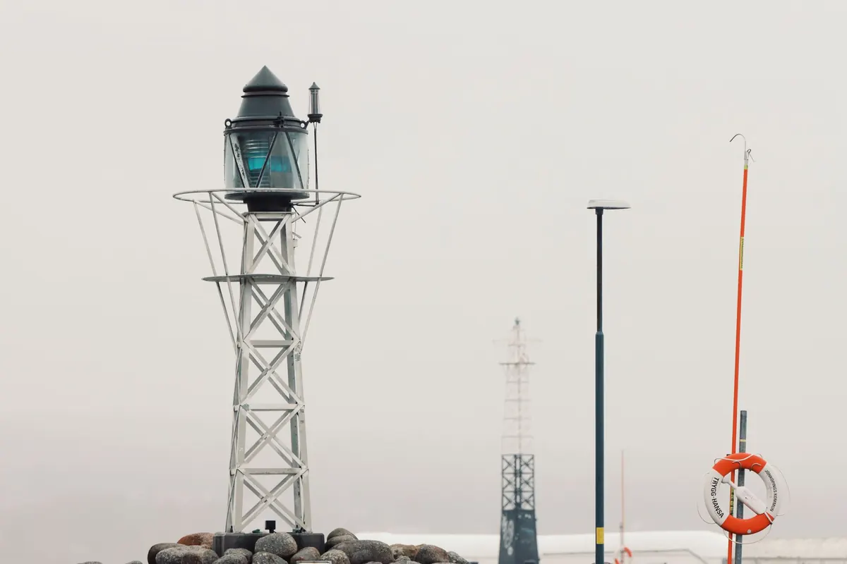
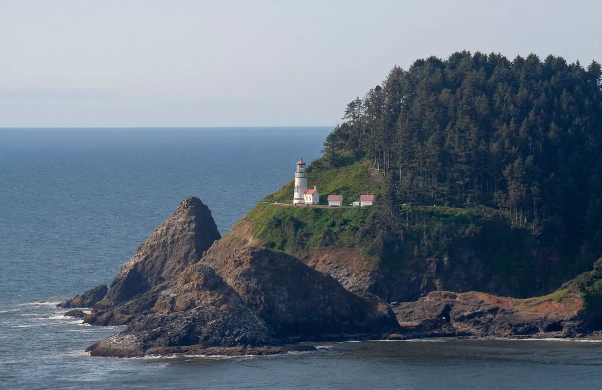
On a flat, bright day, a lighthouse sits inside a wide tonal range: pale stone, pale sea, pale sky. You spend an hour pushing the darks and the drawing still looks washed out. Storm light does the sorting for you. A cloud base low enough to graze the lantern room turns the tower into a silhouette, and the sea behind it becomes a bright, restless band. Suddenly there are only three or four values on the page, and the shape reads from across the room.
Movement helps too. Spray, cloud and blowing grass give you edges that break up, and broken edges are far more interesting to draw than clean ones. The trick is to accept that nothing will stay put. Work small — a postcard to A5 — and work fast. A ten-minute study made in a gusting wind will usually say more about the place than a carefully rendered A3 made from a photograph a fortnight later.
Reading the Weather Before You Open the Book
You do not need to be a forecaster to pick a good sketching window. Two situations repay the effort. The first is the couple of hours just after a front has passed: the rain clears, the light comes in low under the cloud, and hard-edged cumulus sails through with bright gaps between them. The second is the approach — the swell building, the horizon darkening, the tower still lit while the sea turns the colour of slate.
Wind direction decides where you stand. An onshore gale throws spray over the harbour wall and soaks any paper within a few metres, so look for the lee side of the headland, a shed, a van, or the sheltered end of a quay. Watch the wind as you work: it often backs or veers during a session, which changes which face of the tower catches light and which side of the sky is doing the drama.
Sketch the sky first
Cloud shapes in storm conditions have a shelf life of minutes. Before you touch the tower, block in the big divisions of the sky — the dark mass, the luminous slot near the horizon, the direction the streaks are travelling — with loose, light strokes. Then draw the tower into that structure. If you save the sky for last, you will be inventing it, and invented storm skies almost always look tidy and wrong.
A Kit That Survives Salt, Spray and Gusts
Loose paper in a gale is a lost cause. Everything should be attached to something rigid, and everything should be closeable in a hurry.
- A stiff board, slightly larger than your paper, with strong clips. Bulldog clips beat tape in wet weather; tape will not stick to a damp edge.
- Paper of 200gsm or heavier. Thin cartridge paper buckles the moment humidity rises and cockles badly if a single drop of spray lands on it.
- Pencils in the softer grades — 2B, 4B and 6B. Storm scenes are tonal, and a hard pencil will fight you all afternoon.
- A small tin of charcoal or a stick of compressed charcoal for the darkest passages, plus a kneaded eraser for lifting spray highlights out of a grey wash.
- A water-soluble graphite stick or a tiny pan set if you want wet skies. Two brushes is plenty.
- A viewfinder card — a rectangle cut from mount board. In wild weather it keeps you from trying to draw the entire bay.
- A dry bag or a thick plastic wallet for finished sheets, and a cloth for your hands. Salt and graphite make a grey paste that gets everywhere.
- Fingerless gloves and a pencil on a string tied to the board. Both seem fussy until the first time you need them.
If you work in watercolour, keep the palette lid closed between mixes. Wind-borne spray is fine — it lands as a soft texture you can leave — but a wave over the wall will end the session, and salt water lifts a wash you were proud of.
Three Values, Then Contrast
Decide your value structure before you commit: a dark tower, a mid-tone sea, a light sky — or the reverse, with a bright tower against a bruised sky. Three values, no more. Once that skeleton is on the page, the details are decoration and you can add them with one eye on the weather.
Backlit towers are the most forgiving subjects in rough conditions. Draw the mass as a single dark shape, then cut back into it with the eraser for the gallery rail, the windows and the wet shine on the stone. Front-lit towers need the opposite treatment: leave the white of the paper for the lit face and let the sea and sky press in around the edges.
Spray without fuss
Spray is not white decoration drawn on top of a wave; it is what happens when a shape loses its edge. Leave the paper bare where the spray bursts, and let the sea stop short of it with a few broken, directional strokes. Rub out a little of the wave crest to suggest mist. If you are working in pencil, resist outlining the plume — a spray cloud with a hard contour looks like cotton wool. A handful of scattered flecks and one or two long streaks in the wind direction will read as water in the air.
How to Draw Wind
Wind is invisible, so you draw its evidence: marram grass bent flat, a halyard slapping against the mast, gulls hanging at an angle, the ragged edge of a breaking wave, the blown crest of a cloud. Angle your hatching to match it. Long, fast strokes in one direction suggest force; short scribbles suggest nothing at all.
Try a session of ninety-second studies. One tower, one sky, one sea, timed. Do eight of them. The first two will be tidier than you want and the last two will start to catch the weather, because speed forces you to choose the shapes that matter. Keep them all, including the bad ones — a page of quick storm studies teaches more about contrast than a single polished drawing.
On Site, in the Car, and After
Sketch on location for structure and value, and photograph for detail only. Drawings built entirely from photographs lose the thing that made you stop — the cold, the noise, the way the light came and went. If the weather truly defeats you, work from the car with the window down for a minute at a time, or shelter behind a wall and draw only what you can see.
Keep your back to nothing and your eye on the sea. Wet rocks and wave-cut platforms are genuinely dangerous in a big swell, and rogue waves arrive without warning. Check the tide table before you set up, tell someone where you are going, and never turn your back on the water to concentrate on a drawing. Get the sketch down, then get off the rocks.
A Storm-Season Routine That Works
Give the season a structure and you will end it with a proper body of work rather than a handful of damp sheets.
- Watch the forecast for a change of air mass, and pick a two-hour window rather than a whole day.
- Arrive early, walk the site, and choose your viewpoint for shelter and safety before you choose it for composition.
- Spend the first ten minutes on sky structure and value notes, not detail.
- Make one careful study and three fast ones. Date them and write the wind direction in the margin.
- At home, lay the studies out together. The strongest three or four will suggest a larger drawing, and the tonal notes will be enough to carry it.
Storm season rewards preparation more than talent. Take the heavier paper, tie the pencil to the board, and get out there while the light is doing something worth drawing.
Photo: Ray Bilcliff / Pexels