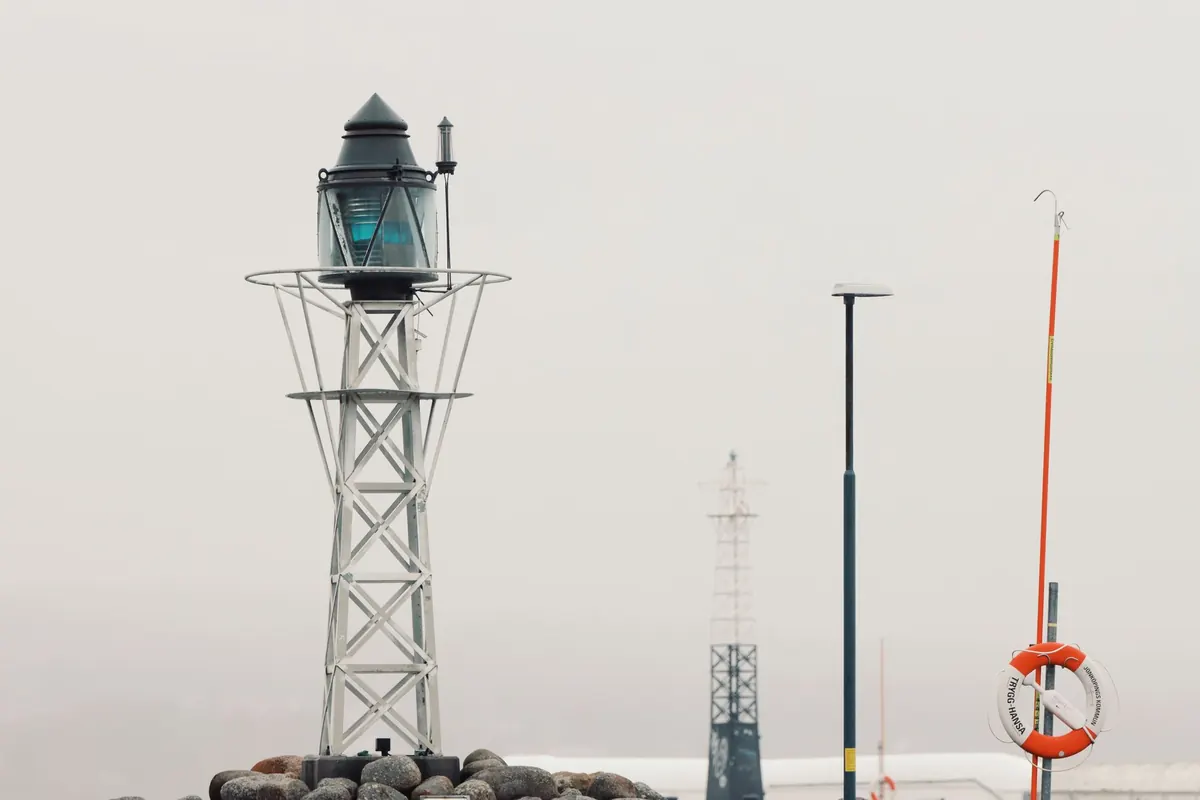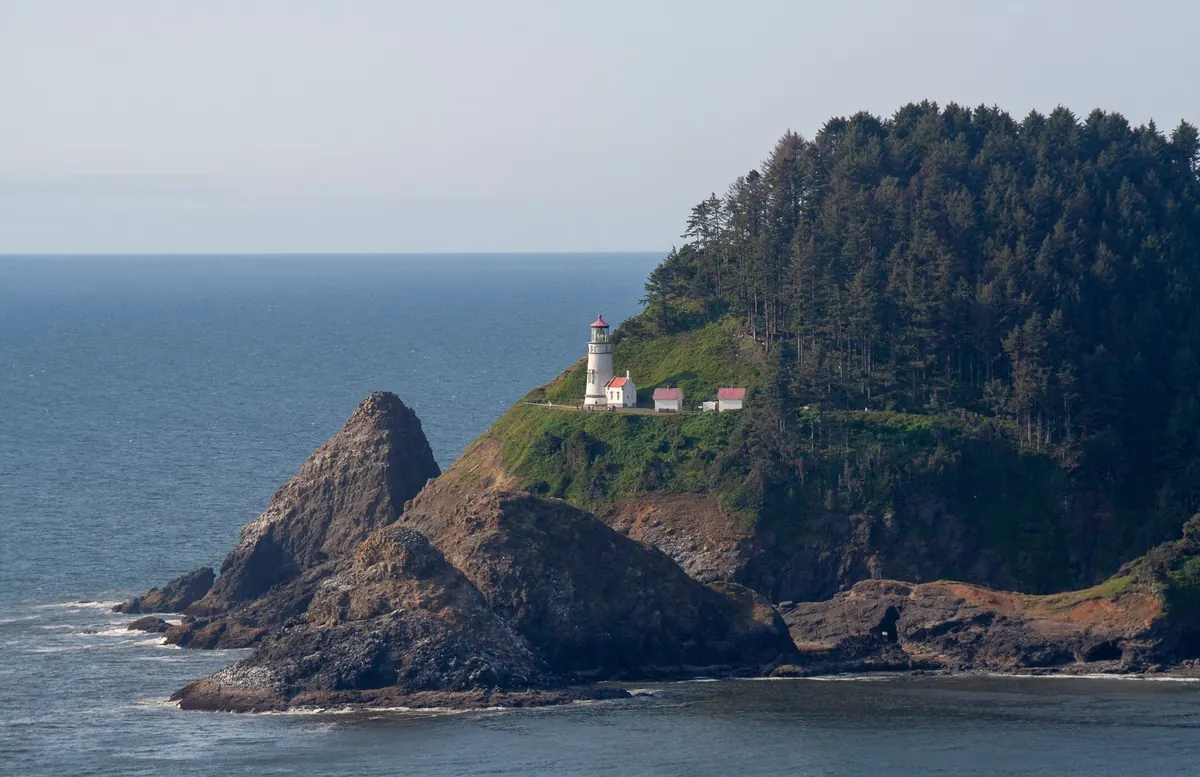
Two sketchbooks sit open on the harbour wall. One holds a tower drawn in soft grey, its edges dissolving into sea haze; the other shows the same lighthouse in black line, every railing bar and glazing panel stated plainly and without apology. Both are correct. Both are lighthouses. The difference lies in what each medium asks of you while you work, and what it hands back when the page is finished.
Graphite and ink are not rivals so much as different temperaments. Choosing between them for lighthouse sketches has less to do with skill than with the kind of drawing you want to make and the conditions you will be making it in.
Tone and Value: The Slow Gradient and the Hard Black
Graphite is a tonal medium that happens to make lines. A 2B laid down lightly gives you the pale grey of a horizon three miles out; the same pencil pressed harder and layered three times gives the shadow beneath a gallery deck. Because graphite lifts as easily as it goes down, an eraser becomes a drawing tool rather than a repair kit. Shape a kneaded eraser to a point and you can pull the highlights off a wet granite base or open a strip of light along the sea. Nothing else in a sketch kit is quite so forgiving.
The cost is that graphite has a ceiling. Even a 6B, burnished hard, reads as dark grey rather than black, and it carries a slight sheen that shows under raking light. If your lighthouse sketch depends on a deep silhouette — a tower against a low sun, a lantern room in shadow — graphite will suggest that darkness rather than deliver it.
Ink cannot blend, so tone has to be built deliberately. Hatching, cross-hatching, stippling and diluted ink washes all do the job, but each leaves its texture visible. That is the trade: graphite whispers a gradient, ink declares a pattern. For a lighthouse, this matters in specific places. Sky behind the tower is easier in graphite. The dark band of rock and foam at the base is easier in ink.
Detail, Line Quality, and the Question of Commitment
Lighthouses reward precision. Glazing bars, the ladder rungs up the tower, the vertical rhythm of a gallery railing, the coursing in a stone plinth — these small structures are what make a tower look like a tower rather than a striped cone. Here the two media behave very differently.
An ink fineliner holds a constant width. A 0.1 nib gives you a line crisp enough for lantern-room mullions at a distance, and it stays crisp after scanning. A fountain pen or brush pen adds pressure variation, letting a single stroke go from thin at the top to thick at the base, which is exactly how you describe a tapering tower edge without measuring anything.
Graphite's point wears as you draw. Lines soften and widen, and a soft grade smudges under a resting hand unless you keep a scrap of paper beneath your palm. The upside is that graphite suggests detail beautifully: a few light strokes can imply a railing without counting every bar, which often reads better than a literal rendering.
Correcting mistakes
Graphite forgives. Erase, redraw, move a window two millimetres left, and no one will know. Ink commits. A stray line stays. You can cover it with opaque white gouache, scratch it away on a heavy paper with a blade, or — the better habit — build the drawing so that accidents get absorbed. A line that wanders slightly off the tower can become the edge of a rock, a gull, a spar of grass. Field sketchers call this making the mistake into weather. It works more often than you would expect, but it requires you to stay loose.
Portability: What Survives a Cliff Path
Both media travel well, but they fail in different ways. Graphite does not care about cold, damp or wind. It cares about breakage and about migration: loose pencils snap in a coat pocket, and graphite dust drifts onto the facing page of a sketchbook, greying a drawing you finished yesterday. Keep pencils in a tin and slide a sheet of glassine between pages.
Ink is more sensitive. Fine nibs pick up grit and salt and start skipping. Felt-tip liners dry out if left uncapped in a breeze. Humid air makes some papers feather, so a line that should be sharp blooms into fur. Water-soluble ink will run if the weather turns, which can be lovely and can also ruin an hour's work.
A sensible lighthouse kit, kept light enough that you actually carry it:
- Graphite: one 2B and one 4B pencil, a small sandpaper block or craft knife, a kneaded eraser, and a hardboard or clip backing so you can draw standing up.
- Ink: two pigment liners (0.1 and 0.3), one brush pen for thicker accents, a pencil for the initial layout, and a plastic bag to sit on when the grass is wet.
- Paper: smooth stock for ink, since rough tooth breaks fine nibs; a medium tooth for graphite so it has something to grab.
- Both: a bulldog clip, because a sketchbook flapping in coastal wind is its own kind of disaster.
The Finished Sketch: Scanning, Framing, and Prints
Graphite drawings are quiet objects. They look best in a sketchbook or behind glass in a plain mount, and they reward close looking — the tonal shifts are subtle and the paper texture is part of the image. Scanning them is fussier than people expect. Graphite reflects light, so a flatbed scan often comes out flat and slightly silvery, and you may need to adjust contrast afterwards to recover the darks you saw on the page.
Ink reproduces almost effortlessly. Lines stay black, edges stay sharp, and a scan or photograph looks like the drawing. If you plan to make cards, prints or a portfolio page from your lighthouse sketches, ink removes an entire stage of correction. It also works beautifully on toned paper, where white gel pen highlights on a grey or tan ground give you a mid-tone for free.
Using Graphite and Ink Together
You do not have to choose, and many field sketches are built in both. Draw the tower in light pencil first — verticals, gallery width, the height of the lantern room — then ink the architecture once you are sure of it. Leave the pencil untouched in the sky, the haze band on the horizon, and the soft spray at the rocks. The result has crisp structure and soft atmosphere, which is roughly how a lighthouse actually looks.
Two cautions. Do the graphite first in any area that will stay graphite only; soft pencil dragged across dried ink sits on the surface and smears. And keep the pencil under-drawing light enough that it disappears under the ink rather than doubling every line.
Which Medium Fits Your Style?
Answer these honestly and the choice usually makes itself:
- Do you redraw a line four times while deciding where it goes? Choose graphite.
- Do you enjoy texture — hatching, stippling, the rhythm of repeated marks? Choose ink.
- Are you sketching on a headland in wind, drizzle, or gloves? Carry graphite, plus one liner for the accents.
- Do you want the sketch to become a print or a card? Work in ink.
- Are these ten-minute sketches in a pocket book? A single fineliner forces the simplification that short sessions need.
- Are you studying light on water over a long afternoon? Graphite gives you the tonal range.
A Practical Starting Point
Pick one lighthouse you can reach and draw it twice, twenty minutes each, from the same spot and at the same size — once in graphite, once in ink. Keep the two pages facing each other in the sketchbook so you see them together. Most people find the tower itself suits ink, because a lighthouse is geometry and geometry likes a hard edge, while the sea and sky suit graphite. That single comparison will tell you more about your own hand than any amount of reading, and it gives you a reason to sit on a harbour wall for forty minutes with a view.
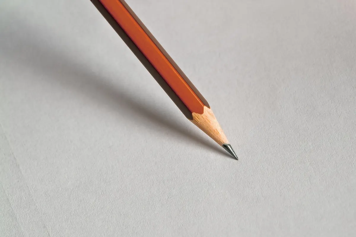
Photo: Pixabay / Pexels